
How to win an ML competition beyond predictive performance
A dive into the challenges and winning solution

A year ago, I took a risk and invested a lot of time in a machine learning competition. I’m happy to say that the bet paid off! In this blog post, I want to share about the journey and the solution that won me two prizes in that competition.
When I became a full-time writer, I decided to cut everything else out. No consulting, no talks, no conferences. It was a good decision at first, but later I felt I lost touch with modeling practice and my world somehow shrank from lack of input.
Then I came across an interesting machine learning competition. Perfect timing, and not only was it a good way to get some practice again, but I also liked the topic of the competition (water supply forecasting) and they also had attractive prizes, a pool of half a million USD. The cherry on top: They had a special bonus track on explainability and communication, where I thought I might have a good advantage, having written a book on the topic and done a PhD.
The competition, hosted on DrivenData, was about forecasting water supply for the arid west of the United States to help with water management. The competition itself was very complex: there were different stages to the competition; we had to predict 3 quantiles instead of just one model output; we had to create many of the features ourselves from e.g. satellite data; the evaluation was based on a mix of requirements like predictive performance, rigor, and scalability; we had to write reports.
This journey was a roller coaster of ups and downs. At first, I had the thrill of competing again and seeing how my solution ranked on the leaderboard. Every “aha” moment that led to an improvement made me super excited. But there was also a lot of doubt: At some point, I had invested a lot of time in the competition and now I felt like I needed to invest more. Was I already in the sunk cost trap? I was even working on weekends, crossing a boundary I usually have.
I was super happy when the competition was over and remember it as a stressful time. The evaluation of the competition, done by a jury on many criteria, took a long time. In my mind, I had already written off the time spent as “lost” time. So I was even happier when I received the notification that I had won 4th place in the overall stage and first place in the explainability and communication track. I have a newsletter draft titled “Why I Won't Participate in a Machine Learning Competition Again”. That’s how bad it was. However, I don’t plan to finish the draft.
Elements of the winning solution
Here are the factors that helped me win in this competition. They are not necessarily prescriptive of how to win a competition, but rather interesting bits and insights that may help you (and future me) in other machine learning projects.
Model summary: For each of the quantiles, I trained an ensemble of xgboost models using snow, precipitation, and previous streamflow features. The evaluation metric used the quantile loss, which the models directly optimized for, thanks to a then recent update of xgboost to handle quantile prediction. xgboost performed best compared to other approaches I tried, such as other boosting frameworks and linear quantile regression. Most of the winners, I think except one, used gradient-boosted trees.
We had to forecast water supply for different sites (dams) and different issue dates. I often considered whether it would be better to have separate models for sites and/or issue dates. However I ended up bundling them together and using site ID and issue date as categorical features. This approach worked slightly better and was technically easier to handle. Amazing how well xgboost worked in dealing with different sites and issue dates in one model.
For the explainability methods, my main method was to use SHAP to present the water supply forecasts. I created a custom visualization based on waterfall plots.

SHAP allows you to specify the “reference” data, which is the dataset used to compute the feature attributions. By default, you would use all the (test) data. But you can also strategically pick subsets to control the interpretation. For the explainability report, we had to explain the current forecast with historical forecasts, for which I used the 20 previous years from the same site and issue date as reference data for SHAP. We also had to explain changes in the forecast compared to the previous week’s issue date. Here the reference data is only 1 data point, but you can still compute Shapley values, which I did.
A known problem with SHAP is correlated features (see also my post Correlation Can Ruin Interpretability). I had two features representing two different approaches to estimating snow in the surrounding mountains that were highly correlated. I dealt with the correlation problem by computing a shared Shapley value for “snow”.
Another shortcoming of SHAP is that it doesn’t show the “local sensitivity” of feature changes. So I combined my SHAP output with these what-if plots, also called ceteris paribus profiles, which are also a new chapter in the upcoming third edition of Interpretable Machine Learning.

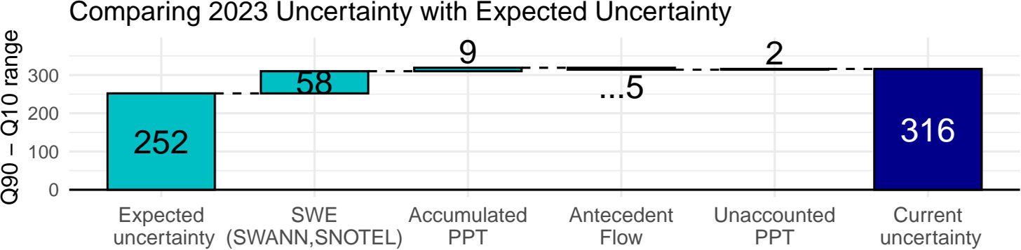
Though not part of the leaderboard ranking, the leaderboard also showed coverage of the 10% to 90% interval. And “rigor” was also a criterion by which models were evaluated by the jury. Coverage was too low for my xgboost quantiles, which is a known problem. I fixed the coverage by using conformal prediction. Conformal prediction, even though it requires an additional calibration dataset and changes the model’s “optimized” Q10 and Q90 estimators, didn’t reduce predictive performance. This was a big surprise to me and helped improve model rigor. So this is what my model prediction pipeline then looked like:

SHAP is model-agnostic, so I was also able to use SHAP to explain the uncertainty. I changed the value function from the model prediction (Q50) to the interval range (Q90 - Q50) and did a similar thing with the ceteris paribus plots. Gotta love model-agnostic methods.
We needed to automatically generate explainability reports for different sites and issue dates. I implemented this using Quarto, which I also use to write books. And it was a great experience. Quarto allows you to parameterize the documents so that creating a report for a particular site and issue date is as simple as changing the parameters.
Excessive notetaking: I was working alone. And what really helped me not get trapped in some local optimum or weird idea was journaling. It helped me “think out loud” and often led to insights.
At the same time, I wrote the book Supervised Machine Learning for Science together with Timo. There was a great symbiosis of both projects since we covered a lot of topics in the book that were super relevant for the competition, like uncertainty quantification, interpretability, and domain knowledge. At the same time, competing helped me write the book because I had a concrete project to think about. For example, the uncertainty chapter uses water forecasting as an illustration.


The competition was hard but also rewarding. If you are interested in the competition, you can check out the interviews with the winners.